
City Debuts New Logo, Branding
There’s only ONE Osawatomie.
A resolution for a rebranding contract was first introduced in May of 2021 at a regular meeting of City Council. City staff presented the idea at the beginning of the Oz Commons Downtown Revitalization Planning Project, known as Oz Commons, and noted that the current logo was lacking in unique identifiers for such a unique community.
In the resolution summary presented to council, staff wrote “The current City of Osawatomie logo, our little green tree, has been in effect since at least 1993. While simple and clean, it is very nondescript and generic, and has no ties to our community’s most notable features. As we embark upon our downtown planning project and redevelopment, we’d like to also look at redeveloping our City identity. … We’d like to find a logo that is uniquely Osawatomie.”
After approval from City Council, staff contracted with professional design company Springboard Creative out of Mission, Kansas, who carries a portfolio of comparable work in municipal branding and logo development. Springboard Creative met with city staff and toured the community before beginning work on draft options.
Over the course of several months, Springboard Creative drafted several different ideas for consideration and brought draft designs back to City Council for feedback and review before a final slate was presented in January of 2022, after the new members of City Council were seated following the November 2021 election. The City Council approved the new logo on January 27th, 2022.
The chosen design features a large light-green letter “O” with an illustration of the iconic Creamery Bridge across the center in a darker green, and includes the water of the Marais des Cygnes river underneath. Osawatomie is known as the town between two rivers and was named for the Osage and the Potawatomie indigenous peoples, from whom the rivers also received their names (the Marais des Cygnes was originally known as the Osage and is part of the larger Osage River water system). The new design honors the history of the community’s origins, geographic identity, and historic landmarks, but the modern and sleek graphic gives it a fresh feel for the next generation. It was important to the design team to create a logo that embraced Osawatomie’s history but still pointed toward a bright future of growth and development.
The negative space in the middle of the “O” that frames the bridge is a subtle hint to the sunrise, according to City staff. “The community is facing so many great and critical projects, from the water plant redesign to the huge street repair plan to the downtown development and all the places in between. There are a lot of good things happening, and it feels like the sun is rising again over this little town,” said City Manager Mike Scanlon.
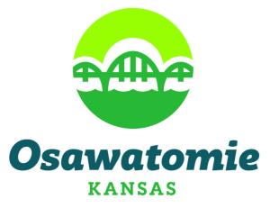
The new logo for the City of Osawatomie, Kansas. The city’s Creamery Bridge and its twin, the Pottawatomie Creek Bridge, are both on the National Register of Historic Places and are two of only eight remaining triple-span Marsh-arch bridges.
The new logo builds off the foundation of the previous logo and still utilizes a predominantly green color palette, which staff believes sets the community apart visually from neighboring municipalities. “The City of Paola’s logo uses navy and maroon, City of Louisburg has turquoise and navy, and Spring Hill is also navy-based,” said Samantha Moon, Osawatomie’s Public Information Officer. “We gave the design team a list of colors we wanted to try to stay away from when we thought about neighboring cities and blue was at the top.”
Springboard Creative designed the icon with different media and applications in mind and made sure the details could be sized up or down, such as when embroidered on a shirt, printed on a business card, or used as part of a billboard or streetlight banner. Elements of the icon can also be used independently to enhance other communication or marketing materials.
Further Development
Within the overall rebranding project, two “exterior” departments also received new logos. The Osawatomie Public Library and the Osawatomie Golf Course each serve a unique set of patrons and operate outside of the normal scope of city services, and city staff believed they needed their own logos to boost their unique qualities while still matching the city brand. Once the main city logo was finalized, Springboard Creative set to work again alongside staff to design additional logos for consideration in those departments.
Library
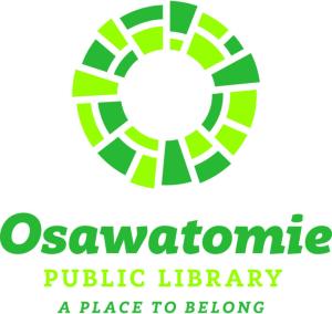
The new logo for the Osawatomie Public Library mirrors the “O”-shape in the city’s logo, but is comprised of multi-hued green tiles in a mosaic effect. The differently sized pieces fit together neatly, and the image evokes the Library’s inclusive tagline of “A Place to Belong.” City staff said the tiles also felt like “an interpretation of a brainstorming session” where ideas get woven together to make a whole, and is reminiscent of the wide array of resources the Library offers under one roof. Staff is glad to have an official and independent logo for the Library, possibly for the first time ever in its history.

Golf Course
The Osawatomie Golf Course also got a fresh, fun update as it prepares for another big year of outdoor recreation and record-setting tournament numbers. Its new logo features the “O” from the main logo, but this time the negative space in the center is used to represent a golf ball on the fairway, with simple clouds and a flagstick in the background – a snapshot of a perfect day out on the gorgeous greens. The previous logo for the golf course was a yellow tree on a red background.
Implementation and Roll-Out
Over the next several weeks, City of Osawatomie staff will be installing the new branding across the organization, beginning with interior communications, forms, and digital platforms. Once those immediate changes are made, exterior communications and signage will be replaced such as the decals on the city’s fleet, wayfinding signage, and other physical materials like the metal logo displayed on the face of City Hall.
City staff is hopeful to have the rebranding effort completed and fully implemented by October 1, 2022.
Media Relations and Contact
If you are in need of the City’s new logo for print or digital media, please contact the City of Osawatomie Public Information Officer with your request.